Tillamook
![]()
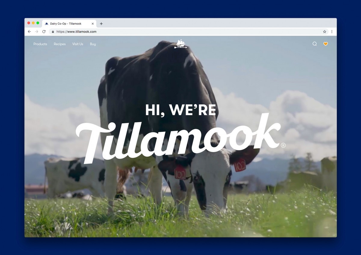
With over 100 years of local heritage, Tillamook is a beloved icon in the Pacific Northwest, USA.
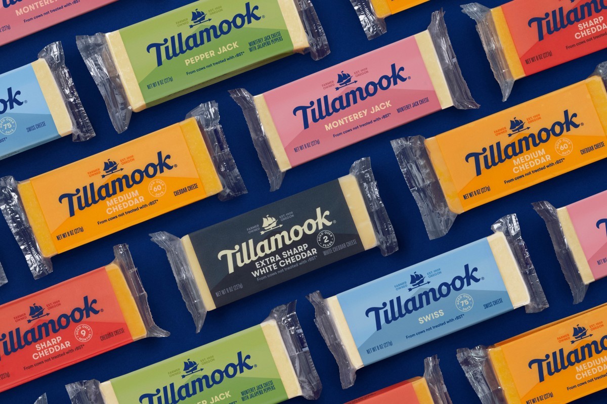
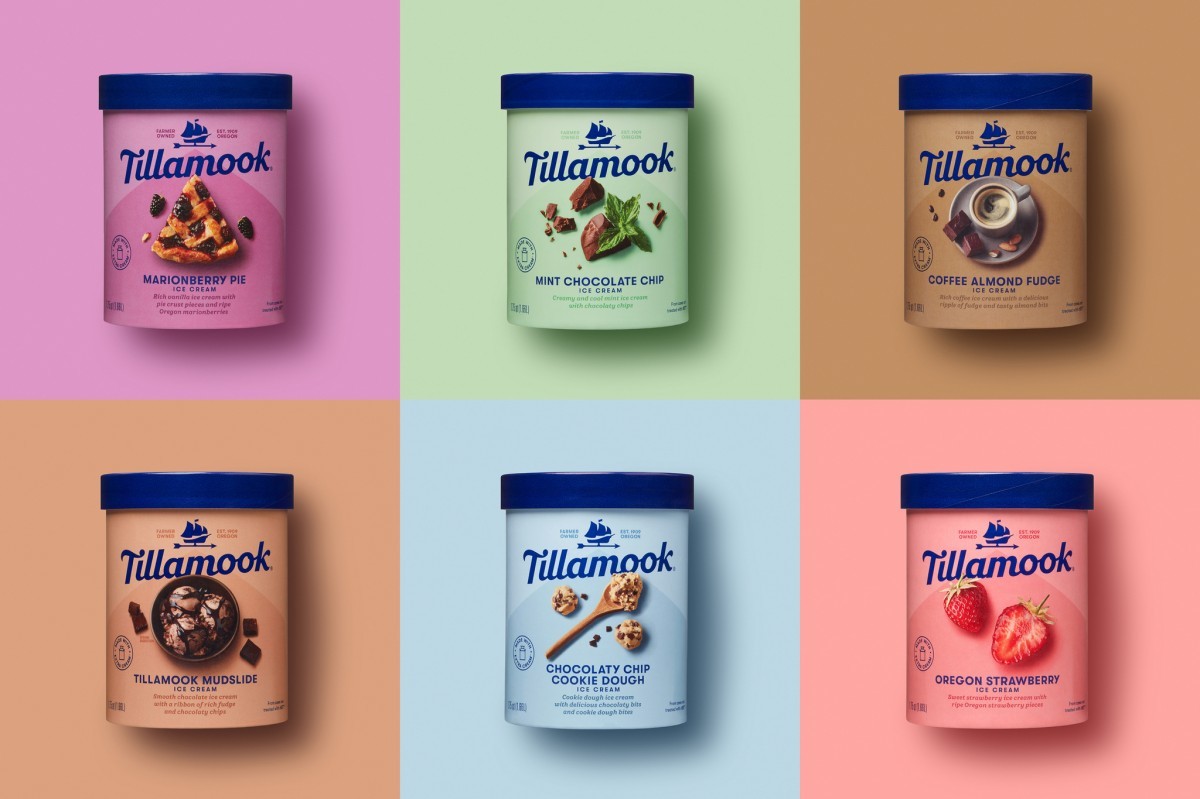
National expansion, product innovation and an increasingly competitive landscape prompted the most significant redesign in 60+ years. The challenge, to unite an array of offerings within a timeless, cohesive system that would make an entrance in new markets and allow for new product offerings while staying true to its roots. A wordmark inspired by history, an icon to celebrate the unique Morning Star story, and a bold approach to system design that conveys flavor, variety and modernity at every turn.

A heritage-inspired wordmark conveys a touch of nostalgia. Its bold use imparts a fresh modernity. The Morning Star ship, a historic symbol of innovation, is redrawn and liberated. Reimagined as a barn-top weathervane, it now provides a meaningful link between the past and the today’s continuing farmer-focus. The packaging design system has a consistent architecture and color system, creating impact and easy navigation at shelf. The tonal barn roof stages the wordmark, icon and variant story.


Created by: Turner Duckworth: London, San Francisco, New York (UNITED STATES)


