Ester Digital
2020 with its global lockdown is a perfect time to reflect on the travel industry. Has traveling to be a luxury at its best, or is a “thousand stars hotel” and pristine nature really the best way to spend your vacation? Get yourself comfortable, we’re going to explore three brand identity cases that have both.
Ester Digital, a Tallinn-based agency of design professionals, had a chance to create three brand identities for travel companies during a single year.
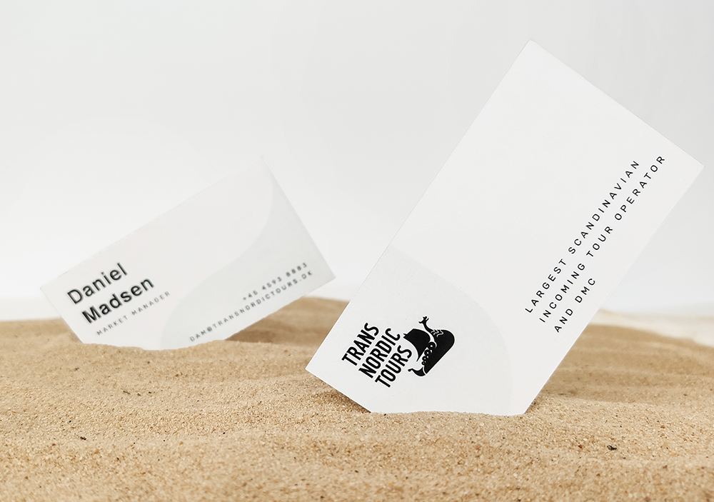
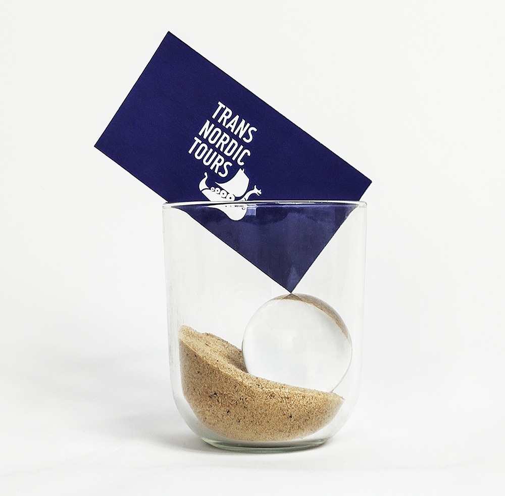
Trans Nordic Tours is one of the largest Scandinavian incoming tour operators for Scandinavia and the Baltic countries. They are not just specialists in Scandinavian culture and leisure, but also keen on preserving their northern heritage. When the time came to update their logo and branding their old symbol, the Viking boat, was an important image to retain.
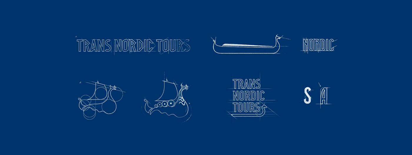
Guided by the seasoned Art Director Tetiana Donska, Ester’s team examined plenty of documentary sources from different epochs, from runic stones to modernist-era Danish and Scandinavian typography and print design. Hours of sketching later, the designers collaborated to create a handcrafted typographic mark inspired by Scandinavian runes and grotesque modernist typefaces. Ensuring the continuity of the brand personality, they preserved the most prominent and recognizable features of TNT’s old logo.
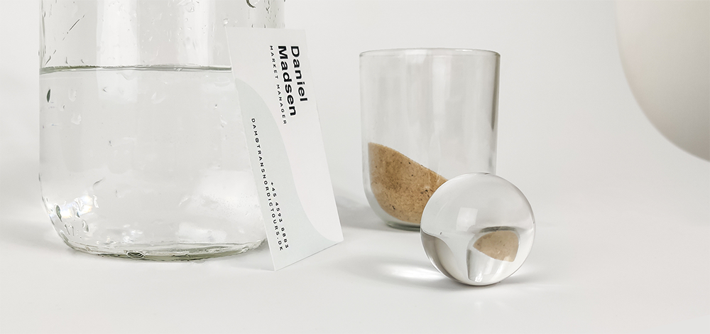
The custom logotype became versatile due to the interaction of the boat symbol and the modular wordmark. Focusing on a blend of modernity and tradition, human nature and eternal landscapes led us to a minimalistic, crystal-clear visual solution.
The next two cases are actually sister brands – and they speak the same language of luxury, one with the urban accent, the other with the rural.
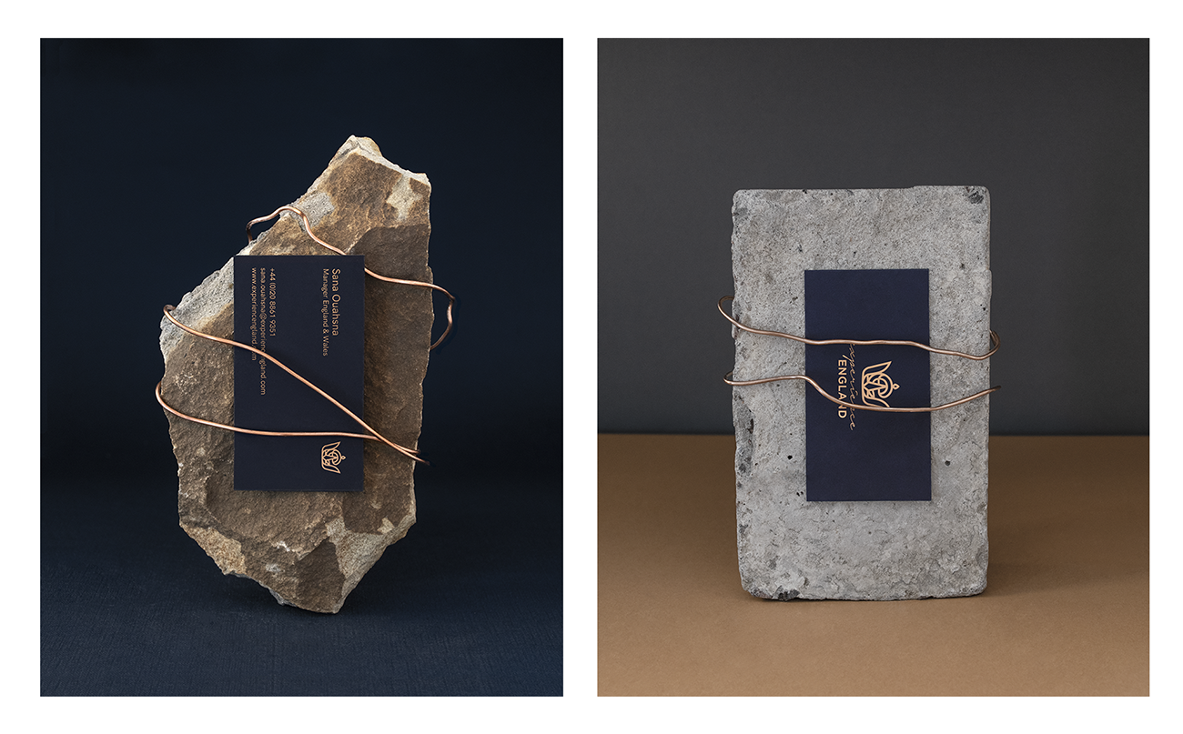
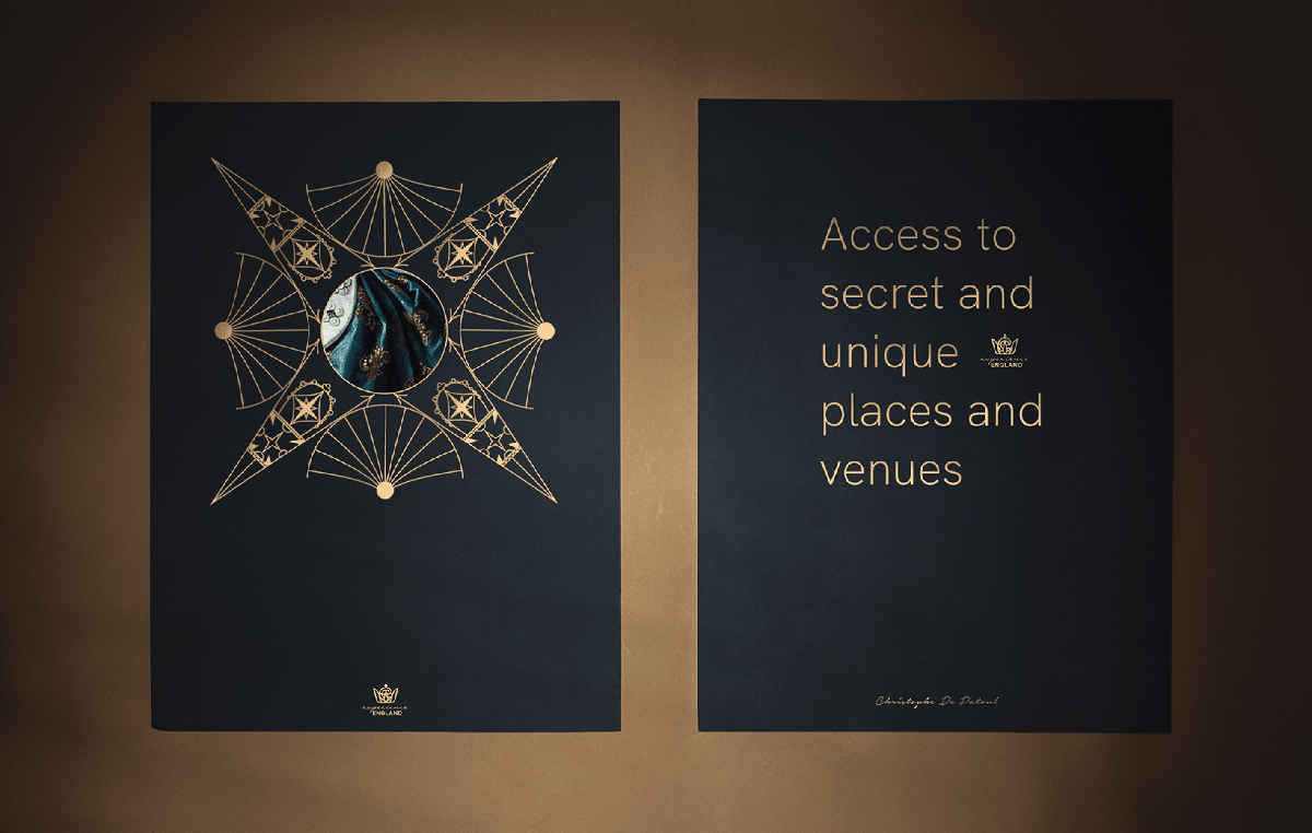
Experience England are the creators of unique events and tailor-made tours in London, England and Wales. They required a truly royal and elegant approach to their brand identity. Clear and professional but with little touches of exuberance.
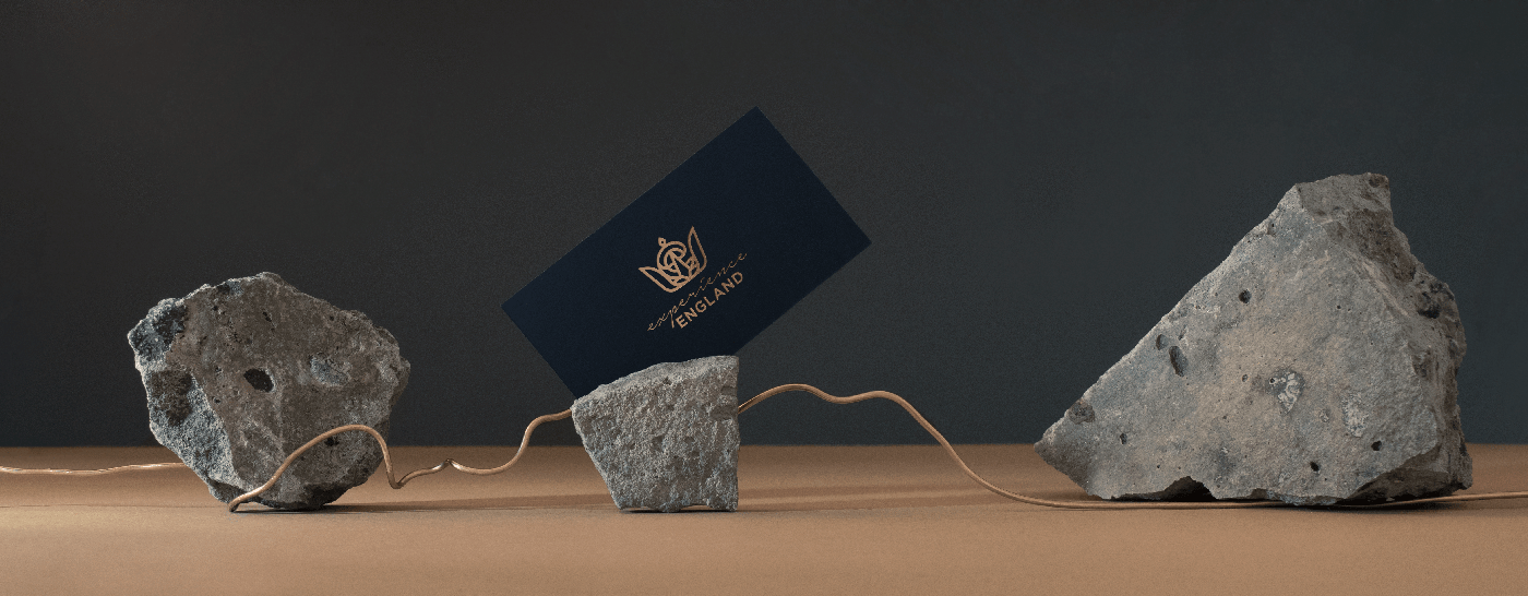
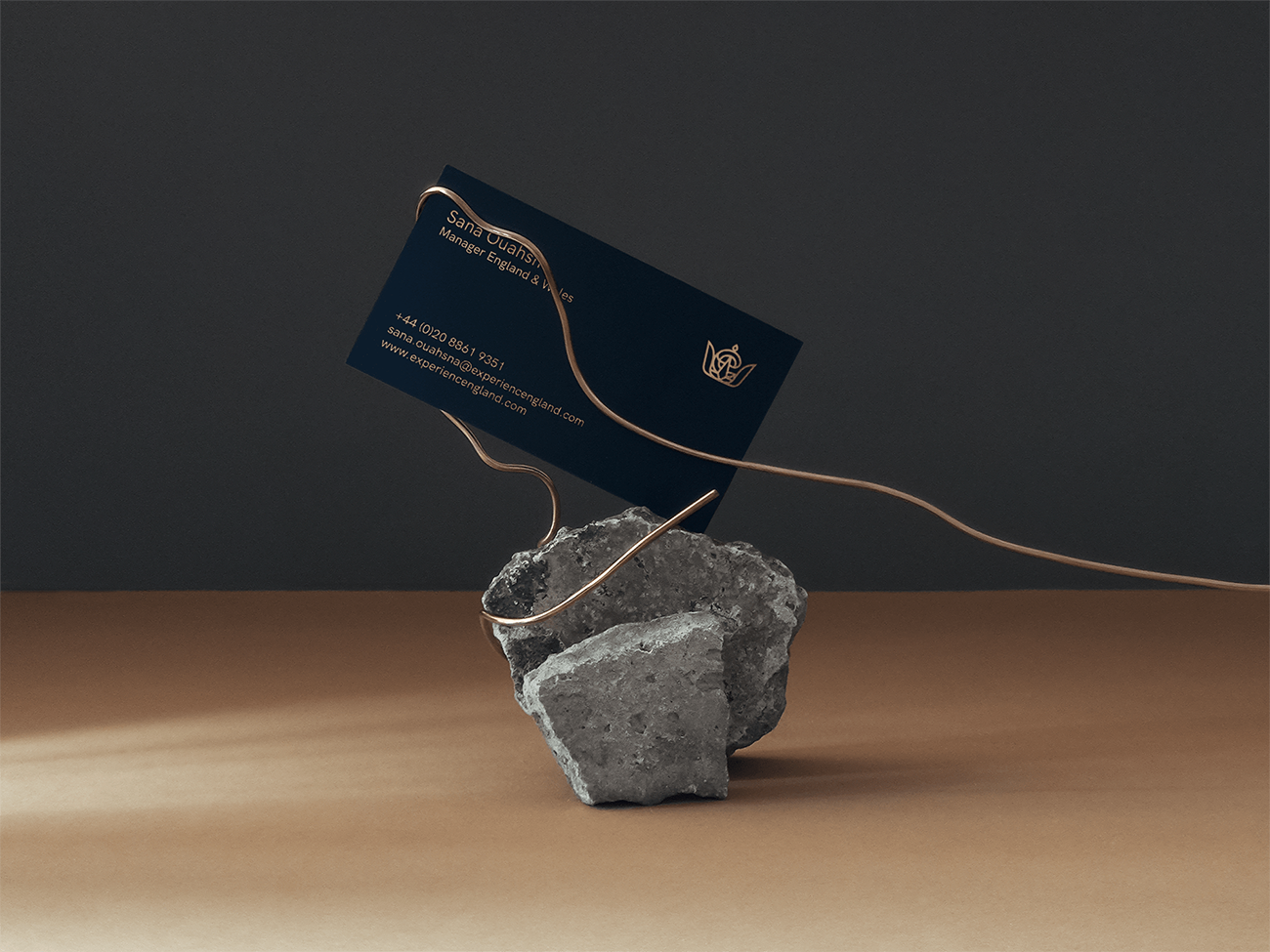
The fact that Experience England is closely tied to British heritage and traditions led Ester’s Lead Designer Iryna to a simple and elegant solution. Hand-written, signature-like script combined with a capitalised geometric grotesque turned into a wordmark radiating the idea of quality and excellence. An ornate crown with the letter E woven into its shape serves as a unique symbol, used independently as well as together with the wordmark.
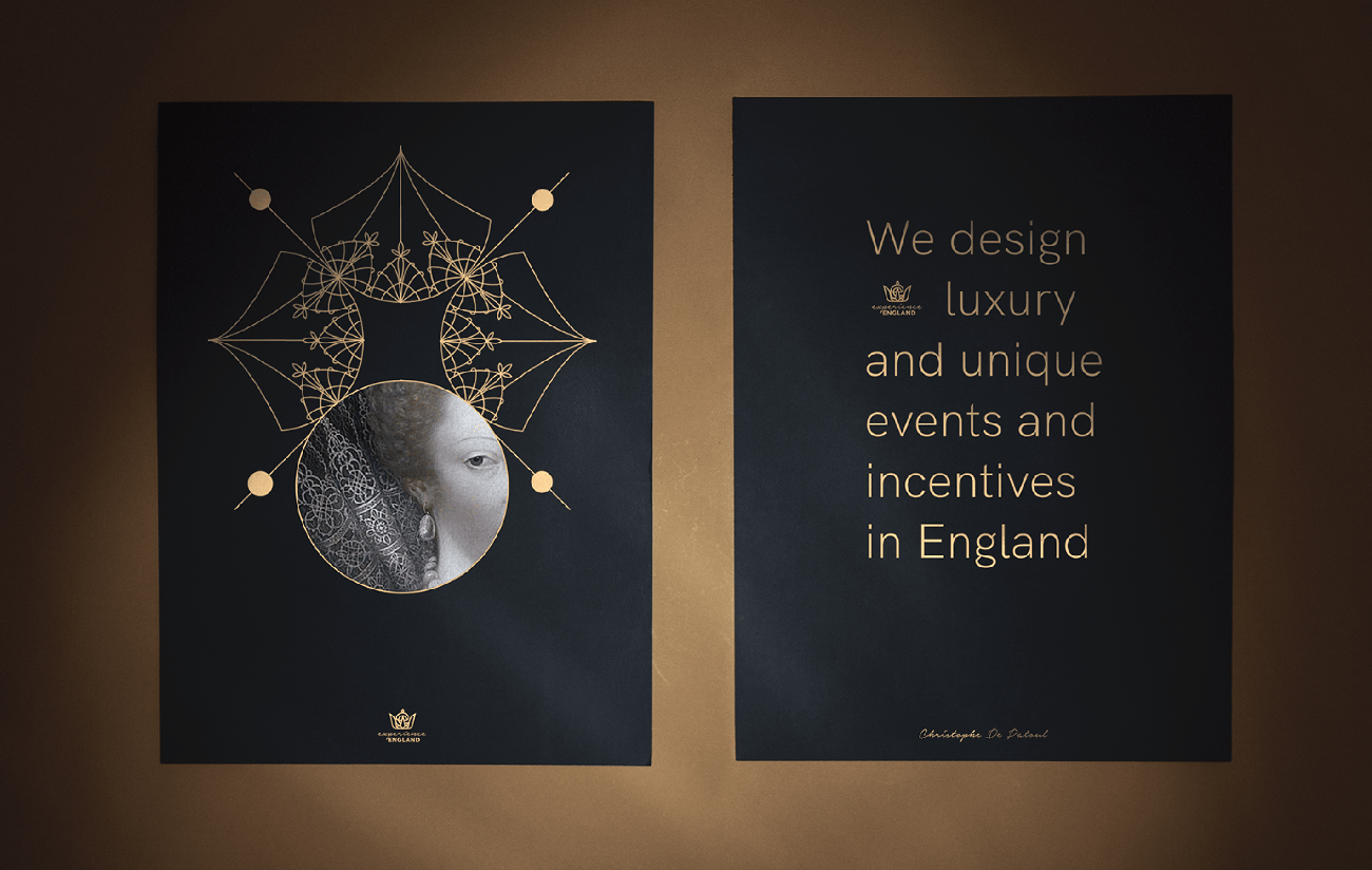
Experience England is indeed a representation of excellence and uniqueness, and it is reflected in the fusion of visual elements Ester brought together for them. Simple subdued colours and typeface A solid, deep shade of blue that sets off the gold and emplaces it rather than clashing with its shininess. A set of intricate posters created by Yuliia Zozulia, Ester’s Visual designer and photographer, is inspired by royal lace collars.
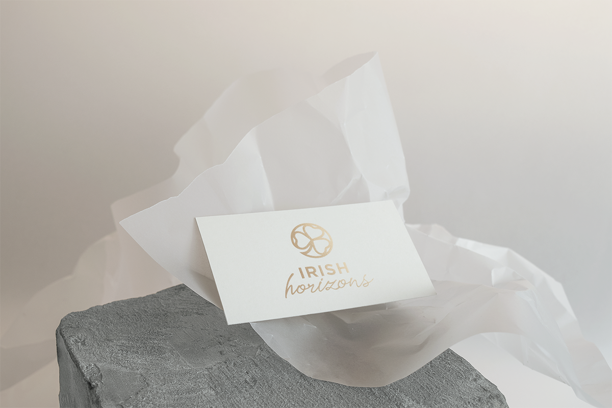
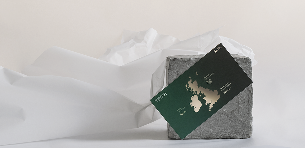
Irish Horizons is a full-service travel agency arranging meetings, incentives, and events with a vast amount of experience and knowledge. Their goal was to refresh and simplify the logo mark, and at the same time, to make their connection to Experience England clearly communicated.
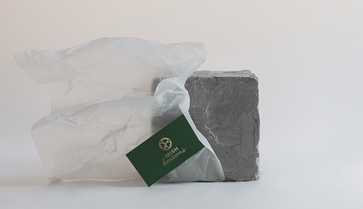
Irish Horizon’s new logo resembles a round shamrock-like seal. It carries deep symbolism in its design. The stylised shamrock represents Irish tradition and culture, and the logo’s round shape is a symbol of the company’s global network and professionalism. The logo’s composition is almost identical to the one of Experience England, which allows their two brands to form a visual rhyme when used in a single space.
In terms of the colours, what could represent the uniqueness of Ireland and its sights better than the rich, royal green and subtle, dimmed golden metallic? Together they make a charming pair, supported by a pastel greyish background.
Irish Horizons’ new logo and font family is modern, simple and streamlined but still meaningful. Due to its simplicity it is equally effective in both digital and physical applications. Together with the other branding elements it is now applied to the company’s invoices, presentations, tour proposals, and many more.

