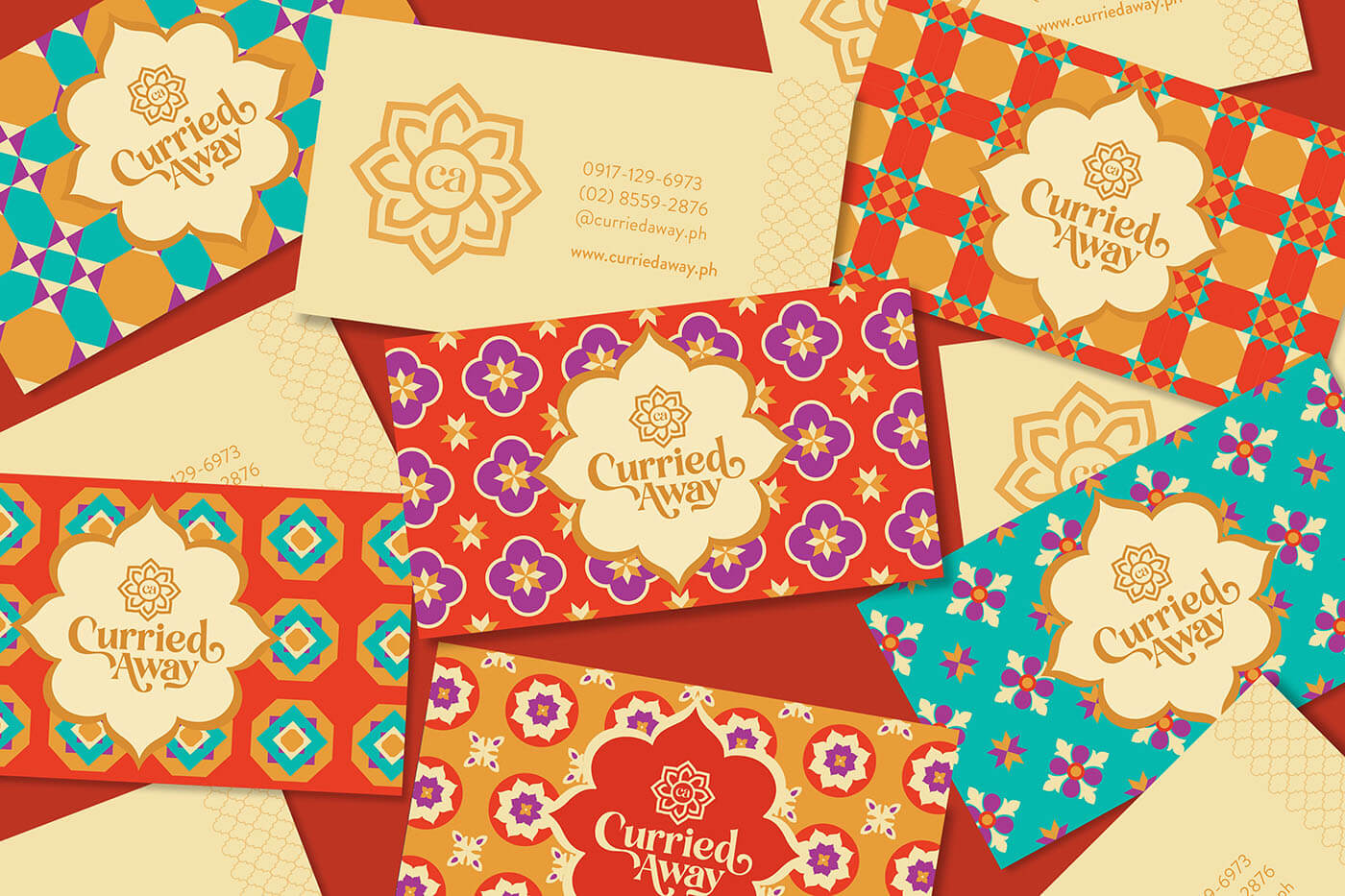
Curried Away branding
Kintal Creative Studio created the Brand Identity Design of Curried Away Indian Restaurant. Curried Away is a hole-in-the-wall restaurant based in Manila, Philippines that offers authentic South Indian cuisine. Their delectable offerings – including Biryani, Chicken Butter Masala, Mutton Kadai, Parotta Rolls, Dal Tadka, and Samosa – reflect the flavors of Tamil Nadu, a region know for its distinct and interesting blend of spices and ingredients. Curried Away is your ticket to a marvelous Indian feast.
It was important for the owner of Curried Away that the brand pay tribute to South India in the way it looked, and as a restaurant that promised authentic Indian fare, it was only rightfully so. Amidst an abundance of Indian restaurants in the city, the challenge was to make this humble joint stand out and be something out of the ordinary. Kintal needed to create a brand identity to could “curry you away” to India; a visual language that reflects both India’s culture and cuisine – bold, vibrant, rich, fresh, and authentic.
In order to showcase the richness and decadence of South Indian cuisine and bring a bit more personality to the brand, Kintal Creative Studio created elements, icons, and patterns inspired by the region’s local spices and their famous Athangudi tiles. These handcrafted tiles are a unique and sophisticated expression of their culture and trade, and a testimony to their rich heritage. Kintal’s overall approach is equally thoughtful as it is bold, a perfect match for a cuisine doused in tradition but never without a kick.


