Neighbourhood restaurant branding
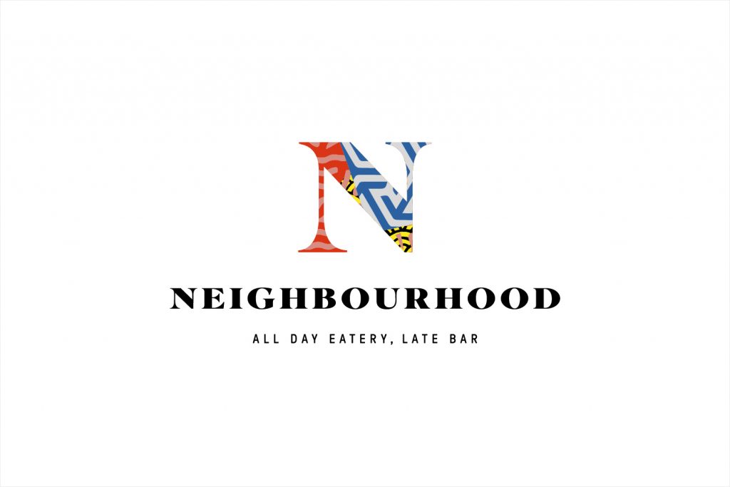
Big rebranding for “Neighbourhood” restaurant by Ahoy. Done: logotype, restaurant interior and web-site.
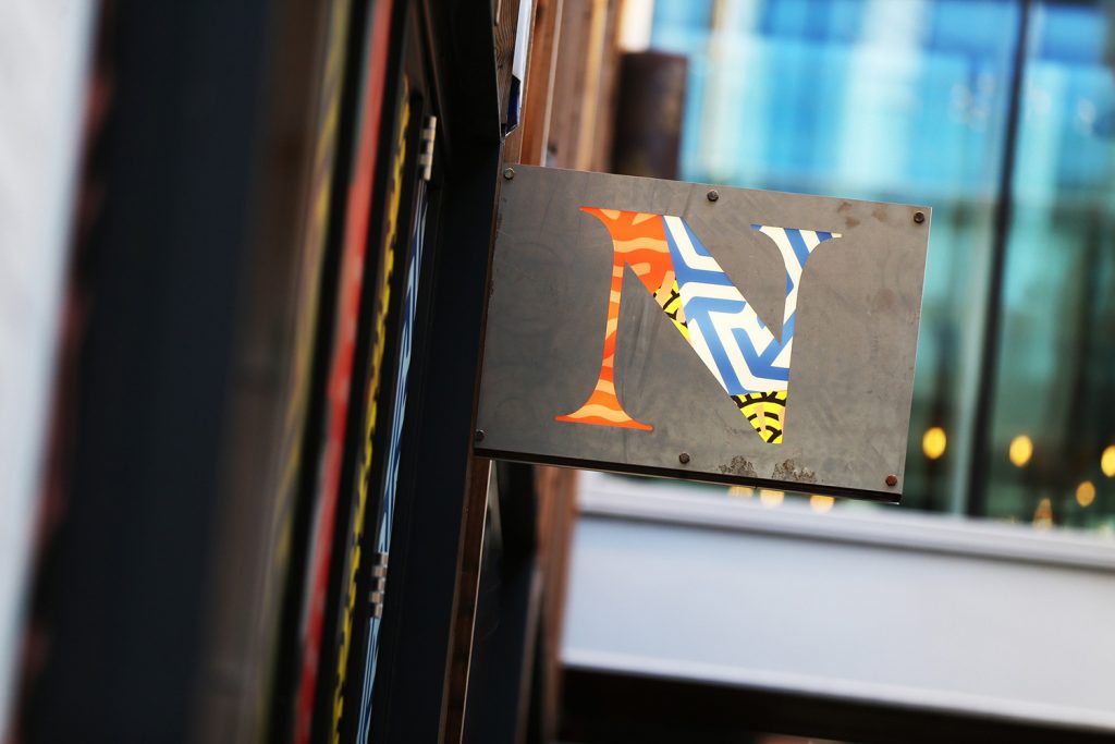
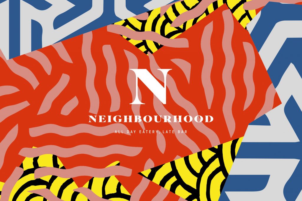
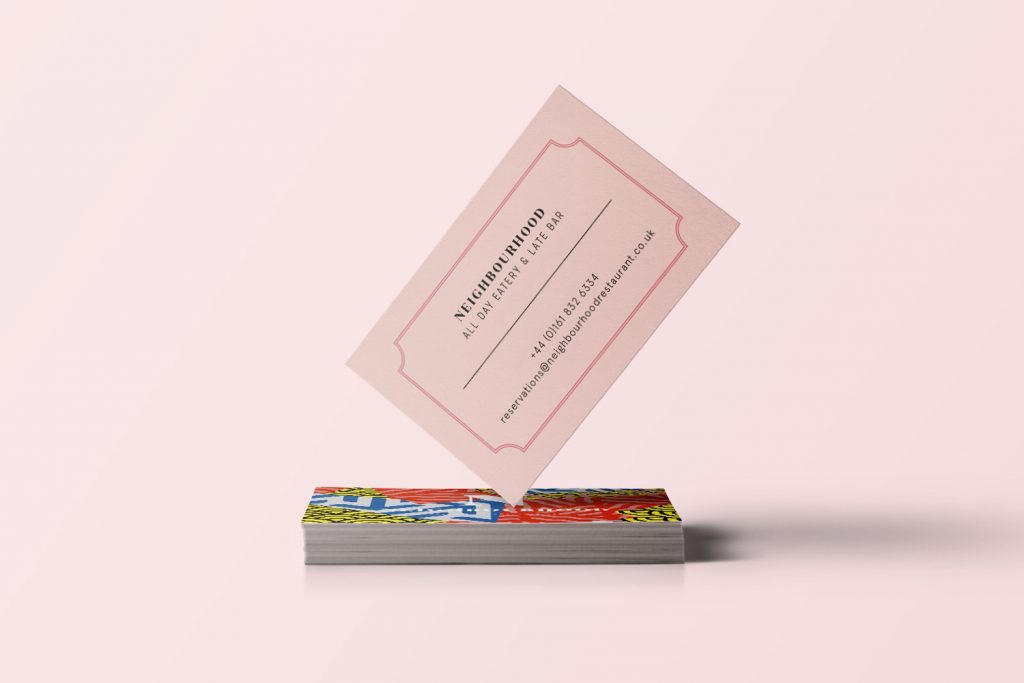
Neighbourhood is a restaurant, bar and club, located in the centre of Manchester, with a vibrant and eclectic interior inspired by New York, Los Angeles and Las Vegas dining scenes. This is brought to life through the juxtaposition of bright neon signage and indoor foliage alongside the more classical qualities of copper fixtures and fittings, marble surfaces and velvet upholstered furniture. This contrast is also expressed throughout Neighbourhood’s brand identity, developed by Manchester and Liverpool-based studio Ahoy, in contrasting colour choice, type and pattern. This links business cards, packaging, menus and interior graphics, and coincided with an extensive refurbishment of the restaurant.
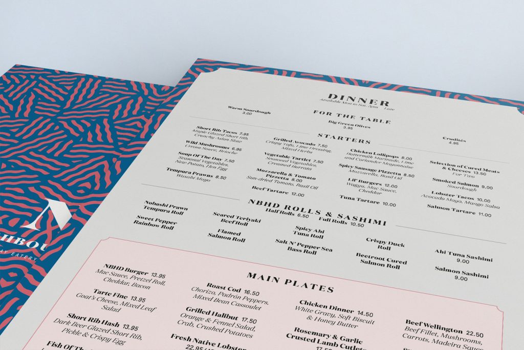
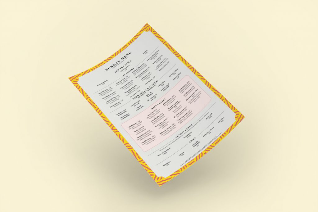
Contrast is frequently used to give visual impact and communicative breadth to brand identity, Ahoy’s work for Neighbourhood is no different, except to say that the two opposing elements, that of extended serif type and traditional typesetting alongside irregular and bright pattern, drawing on the work of contemporary artists, is as disparate as it comes.
In print the menus are perhaps the most explicitly realised expression of this, and the degree to which Ahoy have managed to balance these two references. Continuity between restaurant experience, brand identity (as it exists in print) and website is to be commended. It could have been chaotic, but for the most part feels well-resolved.

