• Home
  • graphic design
  • architecture
  • fashion
  • packaging
  • advertising
  • more
    • competitions
    • holidays
    • news
    • radugadesign
    • events
    • installation
    • illustration
    • photography
    • tv
  • Русский
  • About peopleofdesign
  • Contacts
  • Subscription
peopleofdesign
  • Home
  • graphic design
  • architecture
  • fashion
  • packaging
  • advertising
  • more
    • competitions
    • holidays
    • news
    • radugadesign
    • events
    • installation
    • illustration
    • photography
    • tv
  • Русский
peopleofdesign
graphic design

We Compost by Seachange

3 months ago Monday September 16th, 2019 201 views
0 shares

We Compost - branding

When organic waste breaks down in landfill, methane, a potent greenhouse gas, is released.

This has been identified as a significant contributor to climate change. Through composting, this organic waste can be repurposed as a soil nutrient which can then play a role in developing local and sustainable methods of regional food production. The challenge of turning this into a consistent resource comes down to good waste management, both on the part of households and collection services. Few of the latter exist, however, in Auckland, We Compost intends to make this a widespread reality. Collecting over 40,000 kg of organic waste and diverting it from going to landfill each week We Compost has grown over the last seven years to become the city’s leading commercial compostable waste collection service.

We Compost - branding

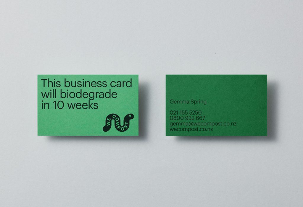
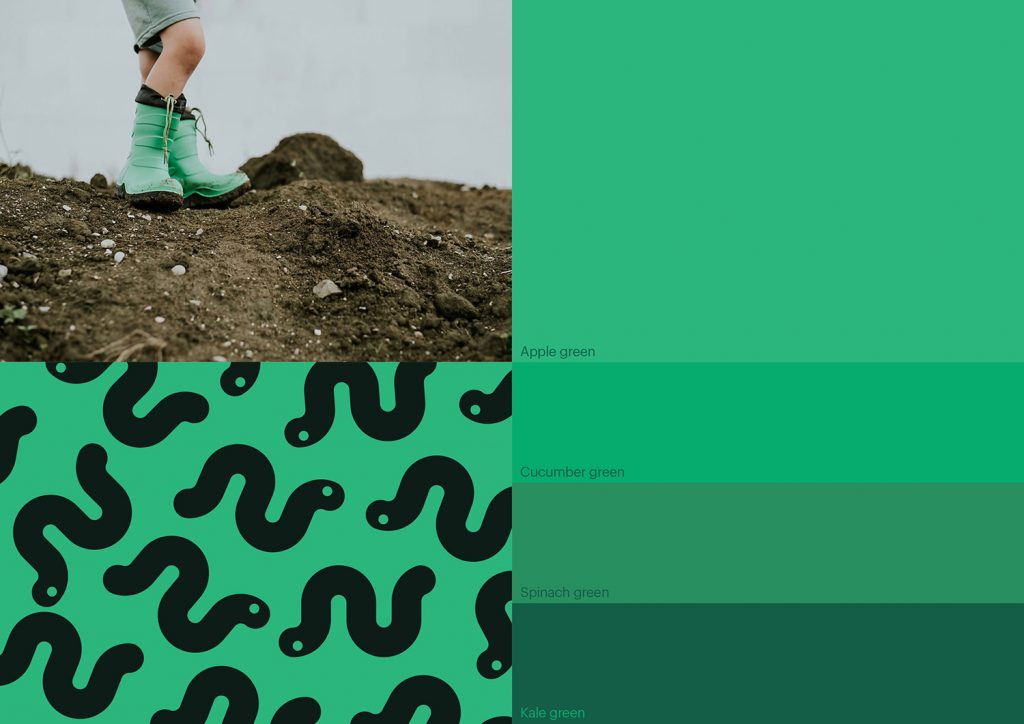
With a desire to continue this growth, We Compost worked with design studio Seachange to help with brand positioning and visual identity, to better align it with their ambitions, make it an every household mainstay and to move it beyond those already invested in ecological challenges and solutions. To achieve this, Seachange’s strategy sought to find a fresh graphic approach to compostable waste management and collection, to find a fun, modern and accessible route that would be an invitation to all ages and types of households to get involved.

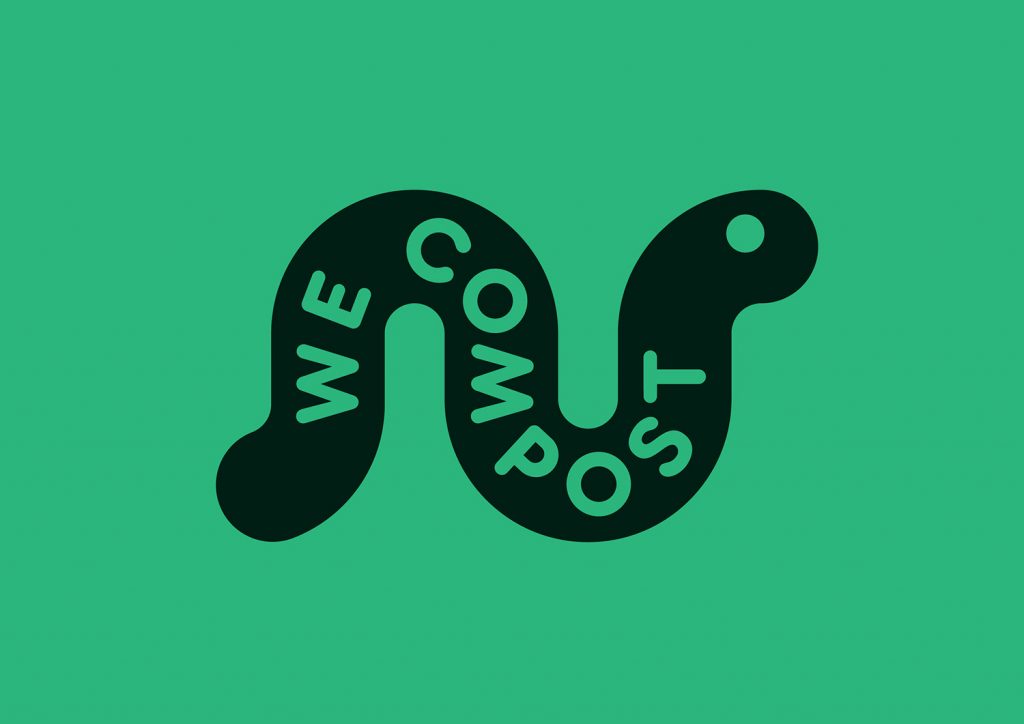
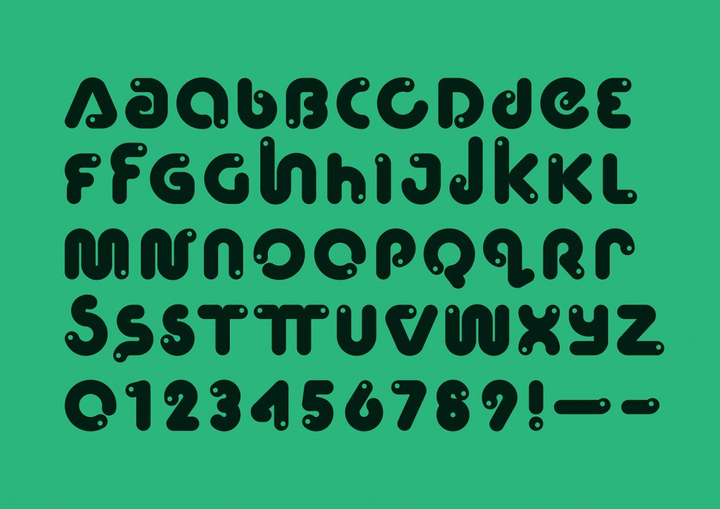
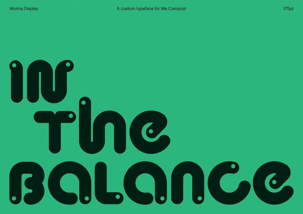
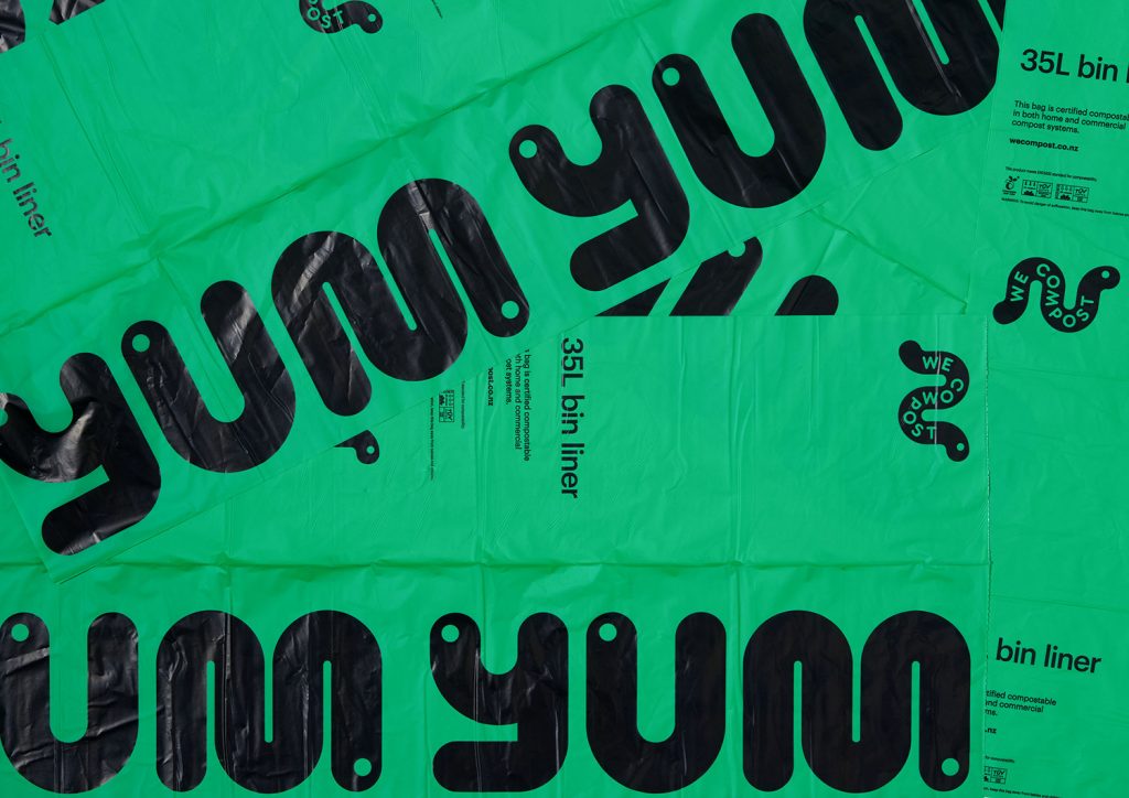
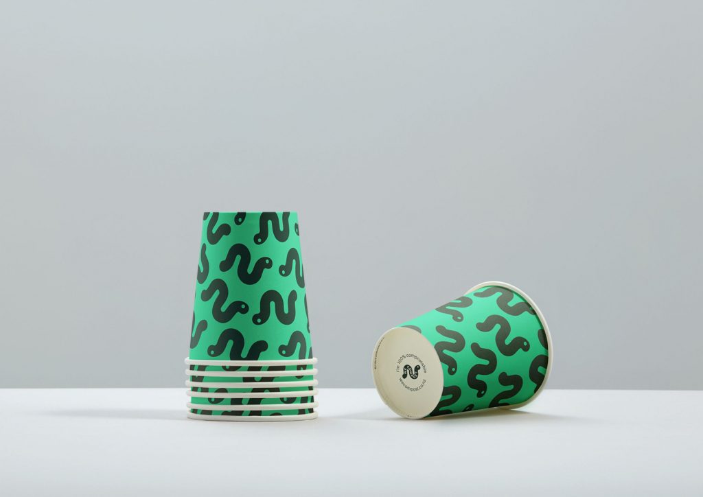
The studio achieved this by way of a custom typeface that draws on the crucial role worms play in the process of composting, and pairs this with a variety of greens. A range of patterns and statements deliver a convivial and recognisable immediacy across differing of contexts, these included bin liners, t-shirts, business cards, posters and website.

Read this:  Обновление бутылки Pepsi

We Compost - branding

We Compost - branding

We Compost - branding

We Compost - branding

We Compost - branding

We Compost - branding

We Compost - branding

We Compost - branding

Design by: Seachange

  • Click to share on Facebook (Opens in new window)
  • Click to share on Twitter (Opens in new window)
  • Click to share on Pinterest (Opens in new window)
  • Click to share on Telegram (Opens in new window)
  • Click to share on Tumblr (Opens in new window)
  • Click to share on Reddit (Opens in new window)
  • Click to share on Flipboard (Opens in new window)
Tags : australiabrandingcolordesigngraphic designgreenidentitylogoseachangewecompost
previous article

Top 20 A’ Design Award Winners

next article

Uniqlo exhibition designed by Pentagram

you might also like

Dunkin and Homesick Limited Candles

Dunkin & Homesick Candle Collection

1 week ago
Unique & Limited Gallery - Ferrari 250 GTO

Unique & Limited Gallery

2 weeks ago Saturday November 23rd, 2019
Medivet new visual identity

Medivet

1 month ago Sunday October 27th, 2019

thank you

latest posts

Cacerolitas restaurant identity

3 years ago Thursday December 15th, 2016

Частный дом Shadowboxx на берегу залива

7 years ago Friday January 18th, 2013

Amtrack: Southwest Chief

1 year ago Friday August 17th, 2018

Navigation

Archives

Archives

Product Hunt

Peopleofdesign - Writes about design, fashion, art, architecture... | Product Hunt Embed
Купить катану на JapaneseSteel.ru
peopleofdesign

Peopleofdesign © since 2006