Hillside Re-branding
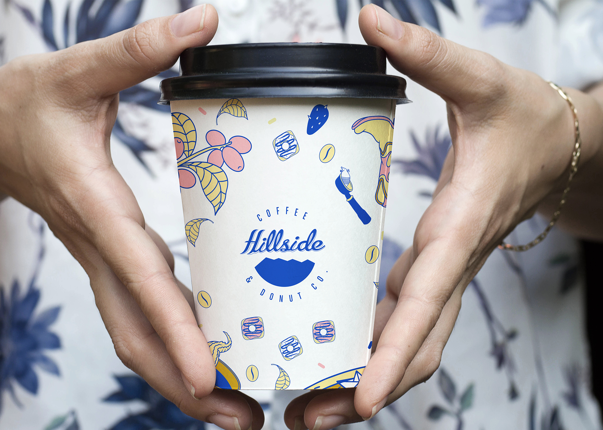
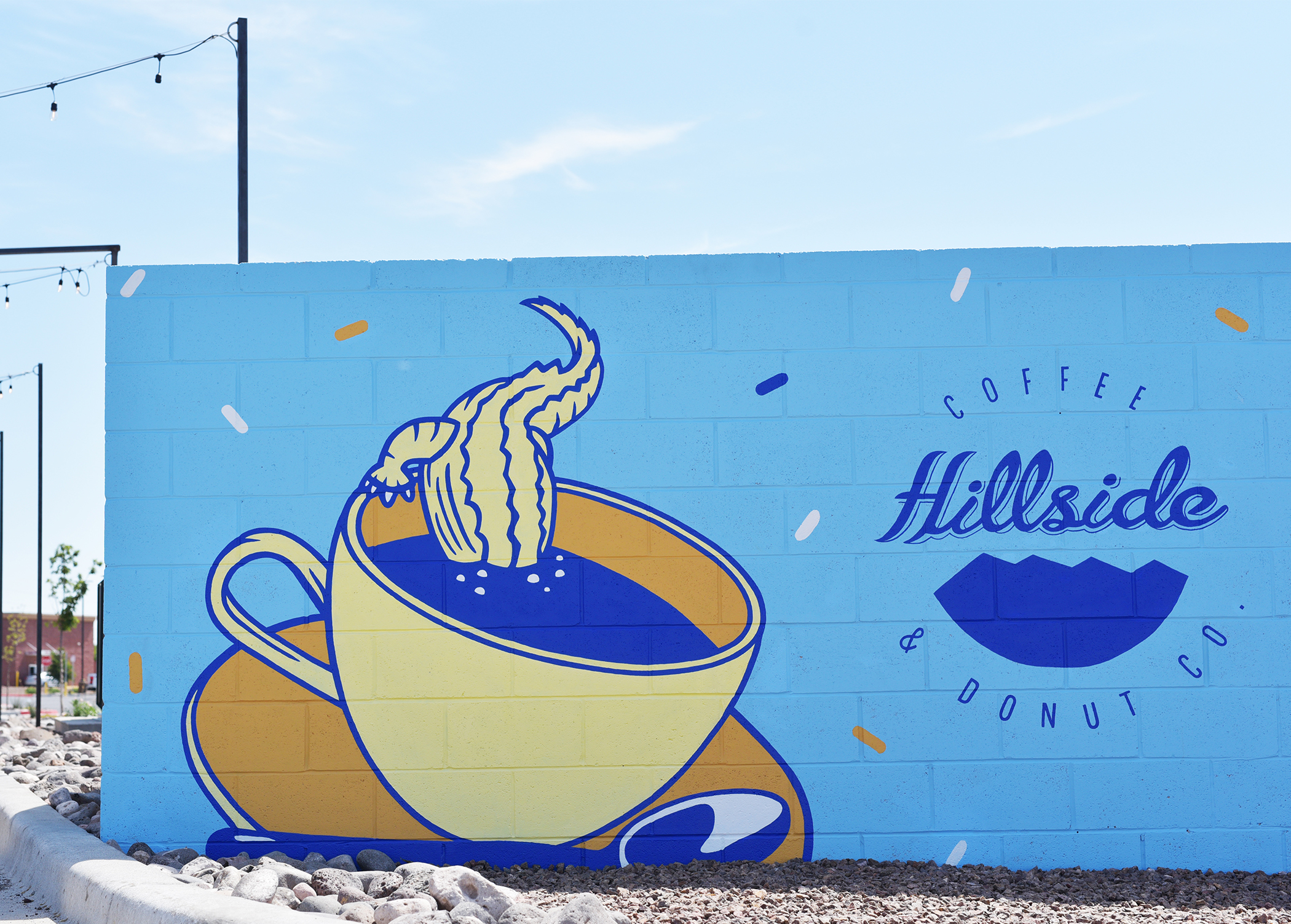
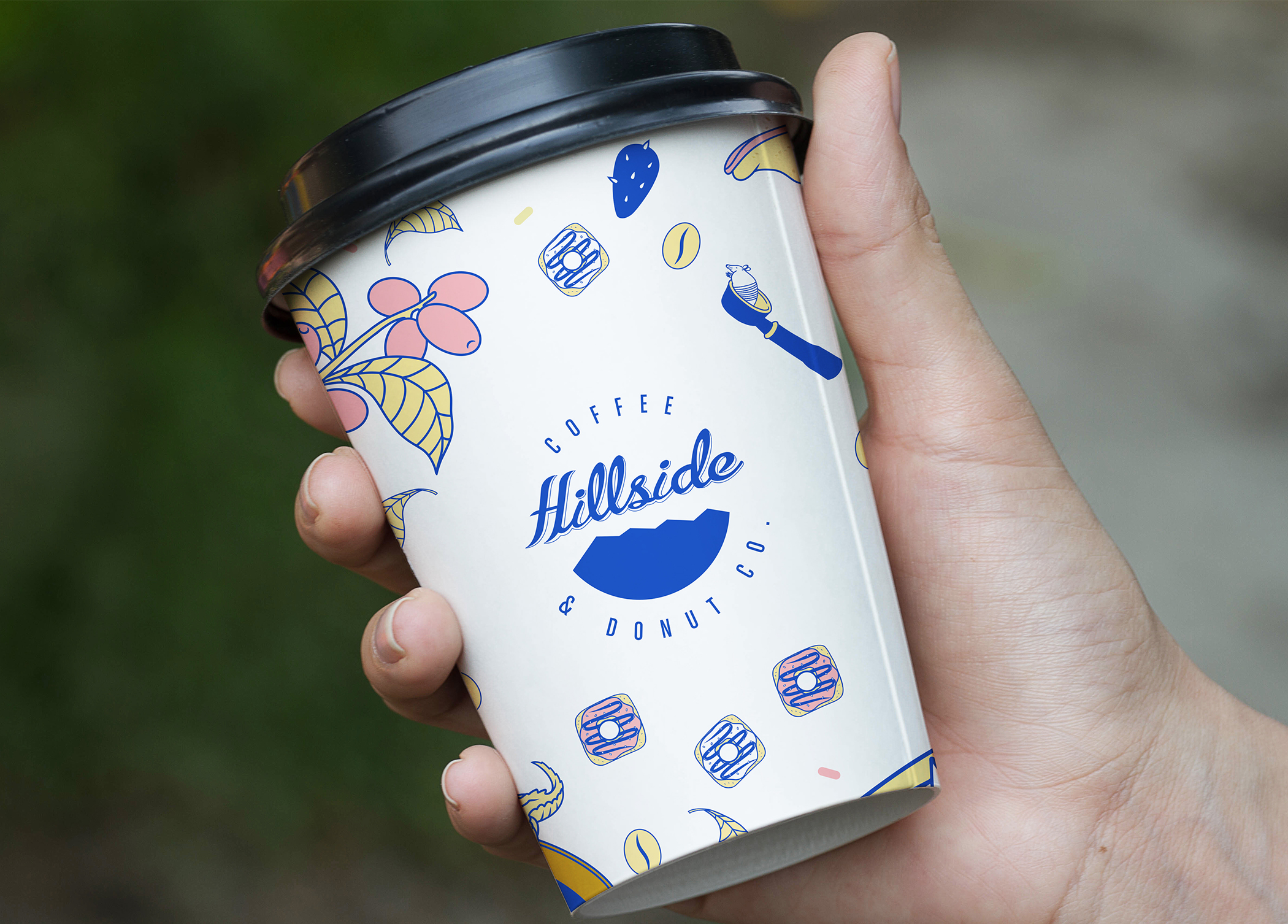
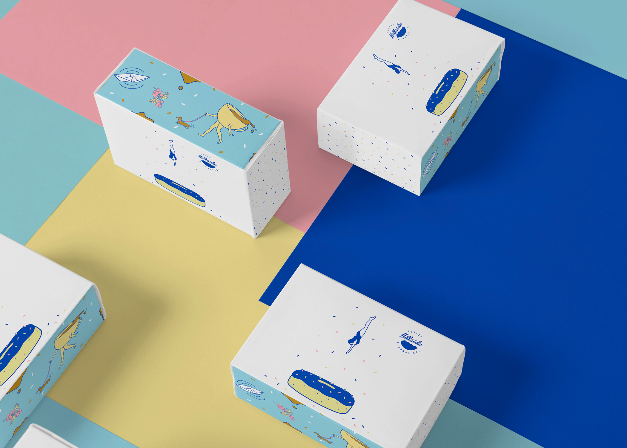
I found this case in the internet. Hillside it’s a coffee and donuts, and EME Design Studio created re-branding of their packaging. They added great illustrations and minimal, clear design.
From the beginning, Hillside Coffee and Donut Co. has been a very well established brand and easy to recognize. As it expanded, we felt it was the perfect time to refresh the brand by adding colors and new visual elements. The creative inspiration comes from the area were Hillside was born. It was very natural to create a world of hip southwest elements and fresh colors that reflect the personality of the customers who enjoy having a cup of coffee at this trendy local coffee shop. The final result, a very fun and exciting brand that feels more alive than ever before.
EME Design Studio has many interesting project in their portfolio. I think you need to check this.


