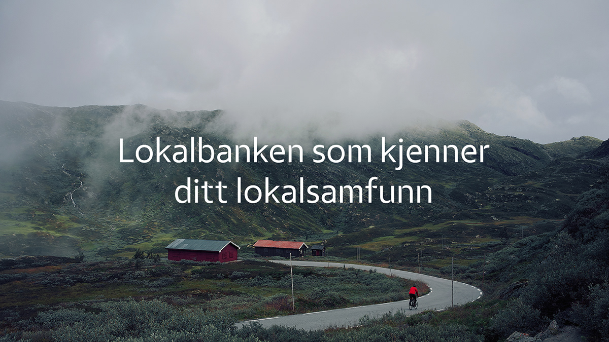
Eika — Local Banking

Mission Design renewing a classic symbol of Norvegian saving banks.
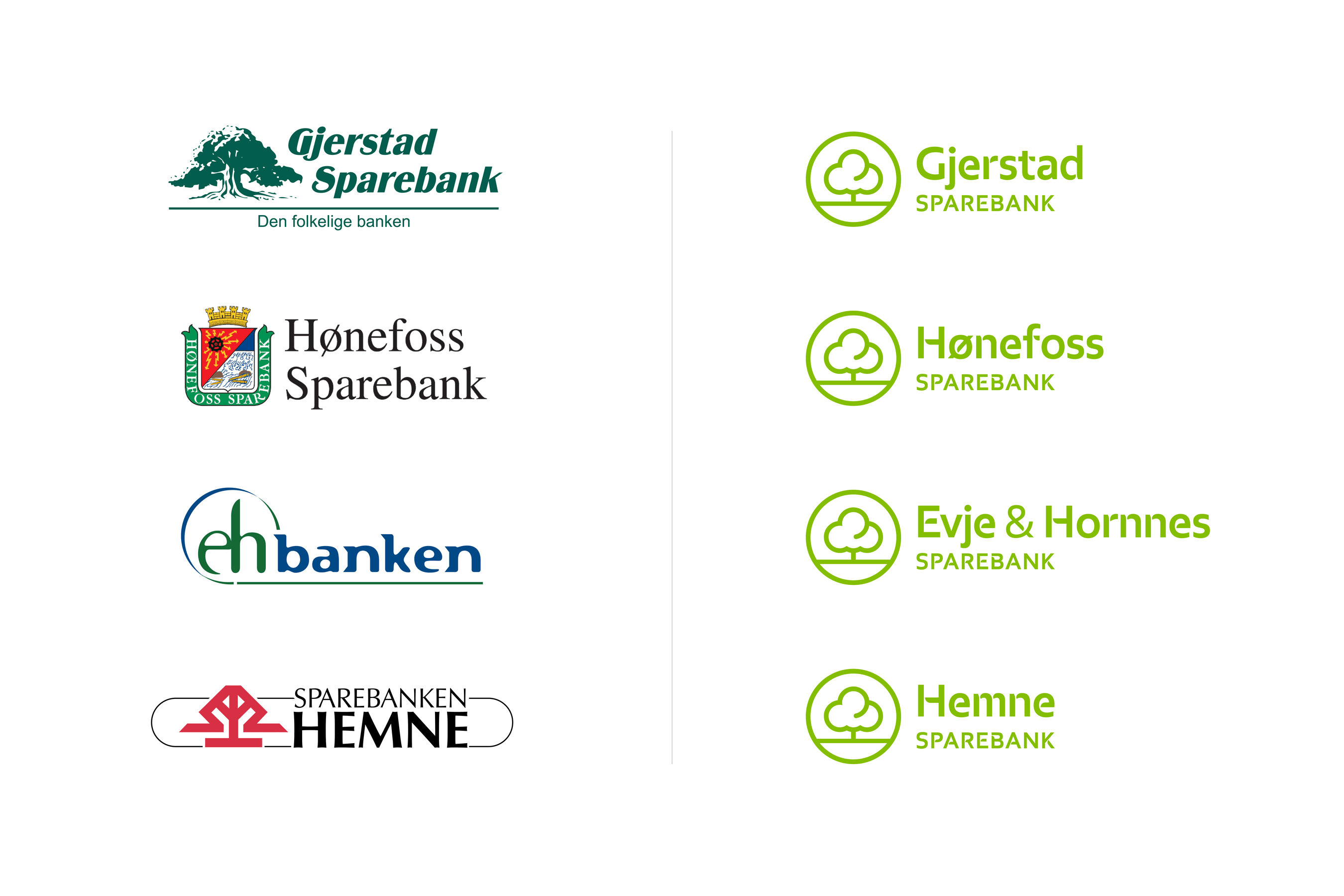
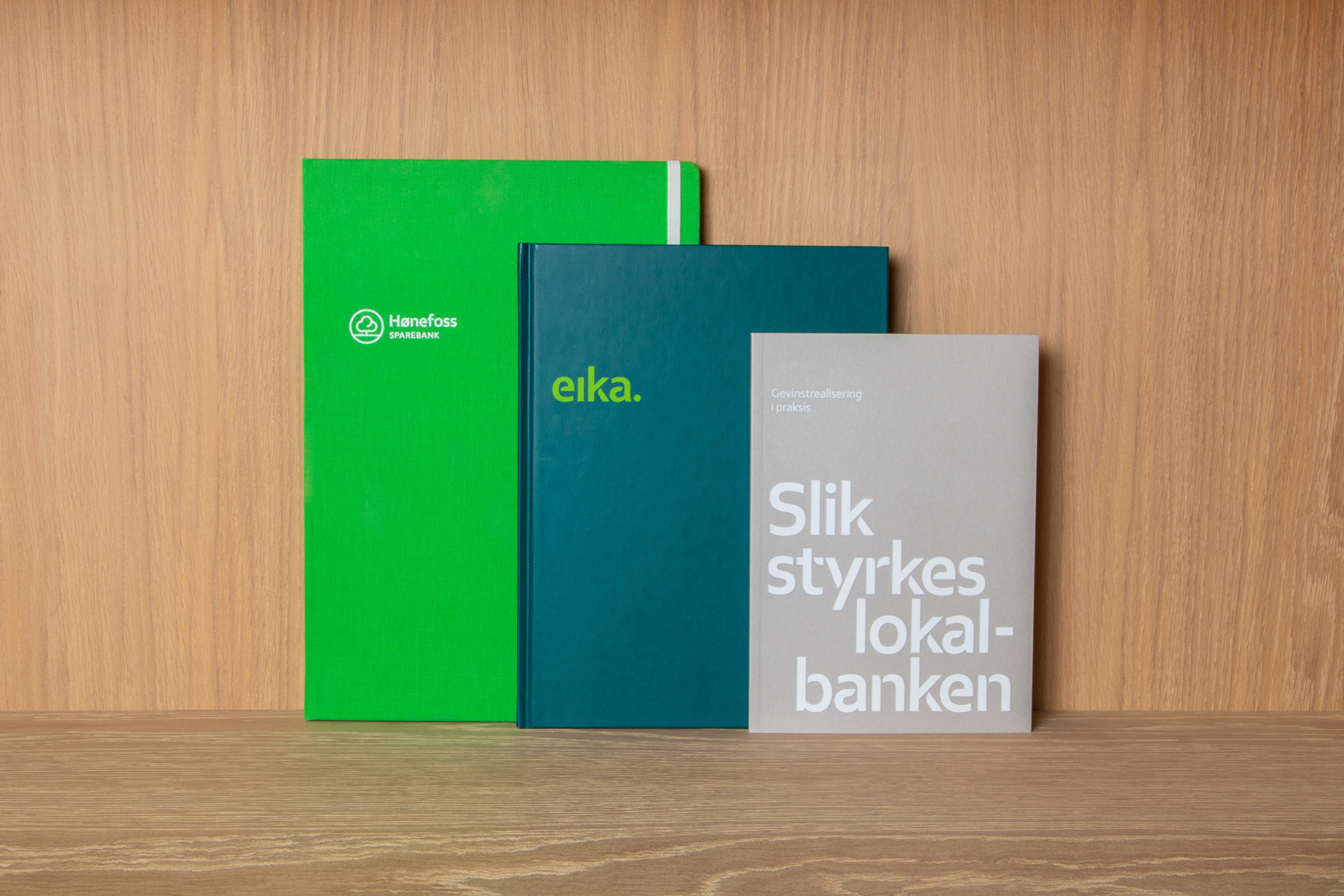
The oak symbol used by Norwegian saving banks is one of the oldest and most beloved symbols in the country. Many local banks still use this symbol today, or variations of it. The Eika Alliance gave Mission the task of modernising the oak symbol for local banks wanting to use it.
One of the reasons for the update was that the classic oak did not work satisfactorily on digital platforms. There was a need for the new symbol to be used for everything from the smallest favicon (web icon) to the greatest wall backdrop. For this challenge simplicity was key.

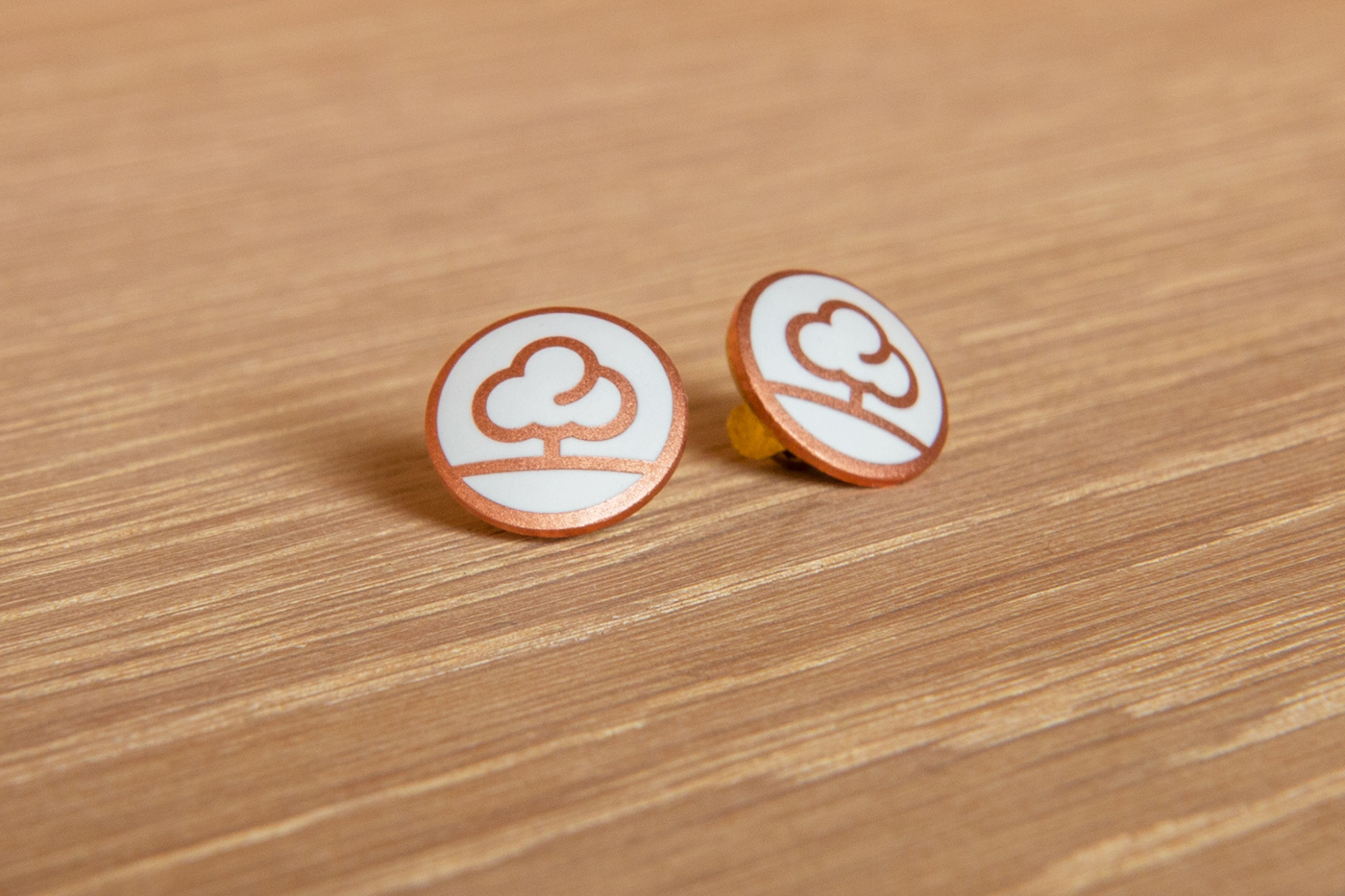
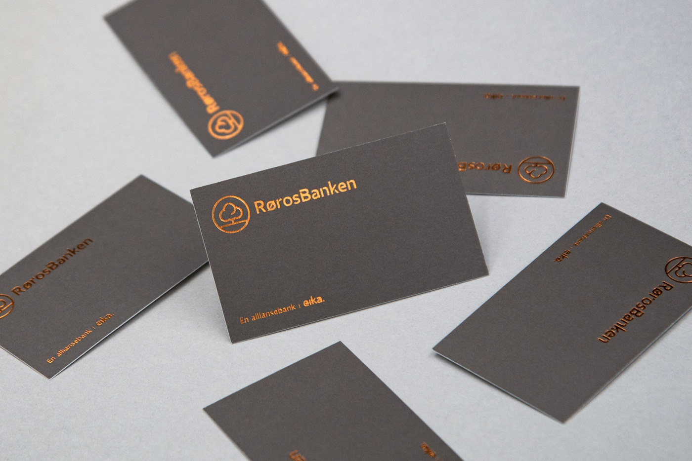
It proved important that the chosen symbol not only be simple and direct but also comply with digital technology, as well as function across other widely used products and services, specially developed for the bank alliance. The shape of the oak symbol is made up of four circles, and it gives the tree a smooth and confident look, fit for a bank that wants to welcome you. At the same time, you notice that the tree itself is both solid and robust, just how you want your local bank to be.

Rørosbanken was the first bank to use the new oak symbol in their logo. The bank launched its new look during the Norwegian Ski Championship in 2015, taking place in Røros. Since then, quite a few other banks have chosen to use this symbol alongside their logo, and by doing so, they send a clear signal that they are local banks in their communities, but at the same time modern and flexible.
Design by: Mission Design
Project on Behance


