Starbucks – redesign by Dennae Makel
Saturday. Many peoples start of saturday with the cup of coffee. Today we are started with coffee too. With the redesign of Starbucks coffee packaging.
This redesign was by designer — Dennae. She has client list: Wired Magazine, IBM, Audible, Chobani, Unilever, Dove и другие.
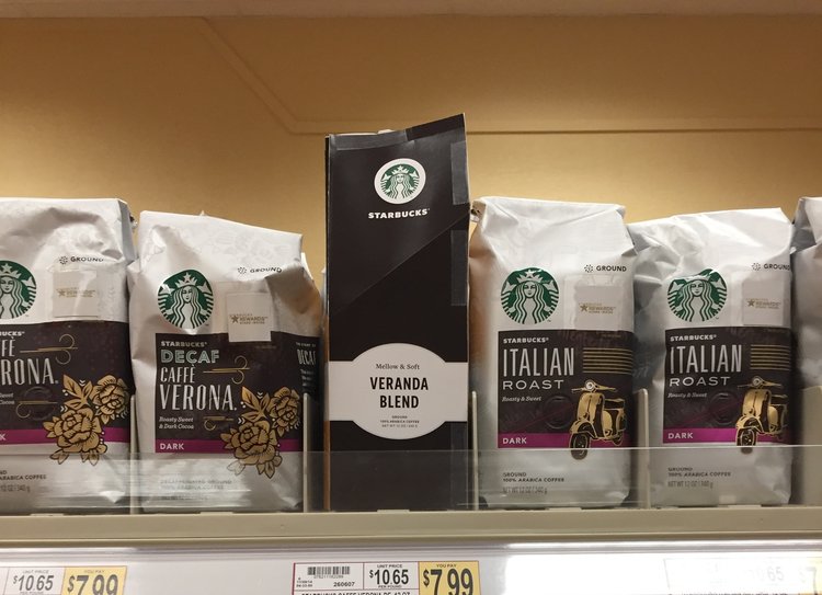
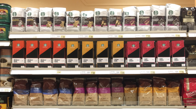
We delivered a new design experience for the 12 oz + 16 oz coffee packages that enhances the functionality, strengthens the brand portfolio and drives customers to purchase Starbucks premium coffee. By researching new, sustainable packaging forms and focusing on a premium coffee experience, my team created a new packaging system that on shelves and boosted consumer engagement.
During our process, we focused on four areas: iconic design; portfolio driven Starbucks design; functionality and experience; and brand loyalty.
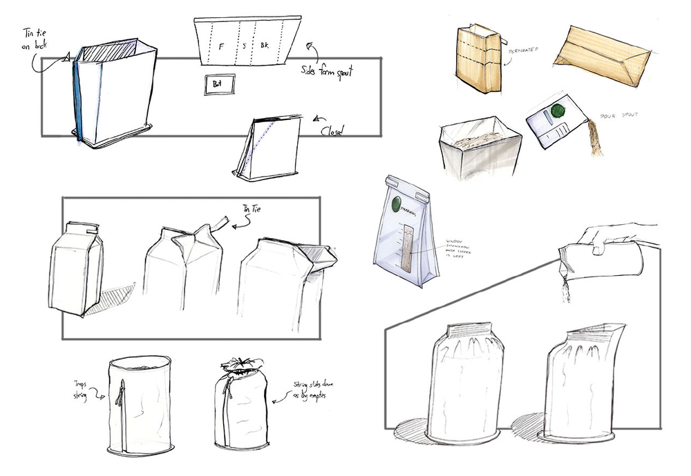
In our process, we explored a variety of new packaging functionalities that reflected the desires and needs from our interviewed consumers. Many of them struggled with pouring their coffee out of a flexible foil laminate pouch. With this in mind, we tested different pour and funnel capabilities that would still allow for scooping. Additionally, we needed to stand out in stores that used warm, dim lighting and break and not blend into other coffee packaging that used beiges, browns, and warm colors.
My opinion of this work – this is interesting redesign, but Starbucks is the legendary coffee with their style and unique, minimalistic design. And i saw many redesigns, but – no, no and no again.


