Leibniz design relaunch

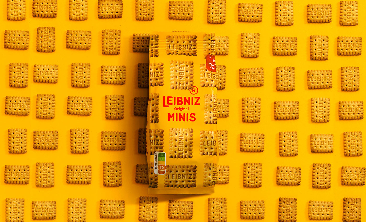
Reminiscent of swelling dough, Leibniz’s new logo – featuring smooth inktraps – brings a warming finish to the makeover from Auge Design. Leibniz – you know, the Bahlsen biscuit known for its distinctive 52 “teeth” design and for polishing off the packet in one sitting – has got a fun new look. Conceived by branding design agency Auge Design, the refresh takes it cue from the iconic designs that are baked into the biscuit itself to revamp packaging, typography and the logo.
Called in by Bahlsen, the most successful sweet biscuit manufacturer in Germany, Auge was asked to deliver a brand aimed at the younger market while highlighting the “naturalness and goodness of the product”, the Auge website explains.
At first glance, the Leibniz logo looks unchanged – a deliberate tactic from Auge. The agency’s site elucidates: “We decided to keep the original rounded style [of the logo] and ‘baked’ it exactly the way biscuits are”. If you look closely at the flattened word mark, you’ll likely spot the subtle inktraps Auge has introduced, mimicking the way dough swells and sets as it emerges from the oven. This typographic treatment extends to the new customised typeface: Butterkeks Display.
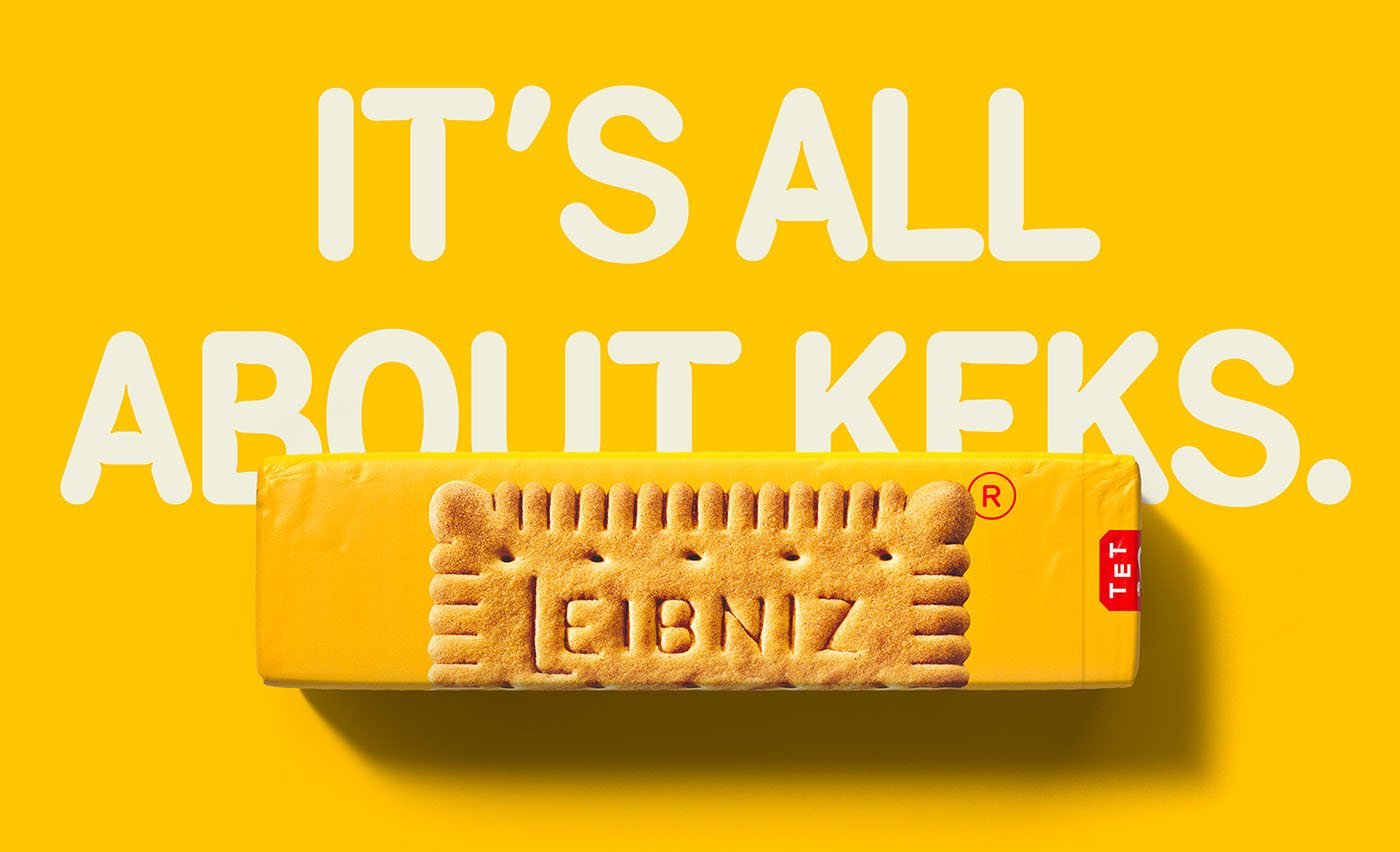
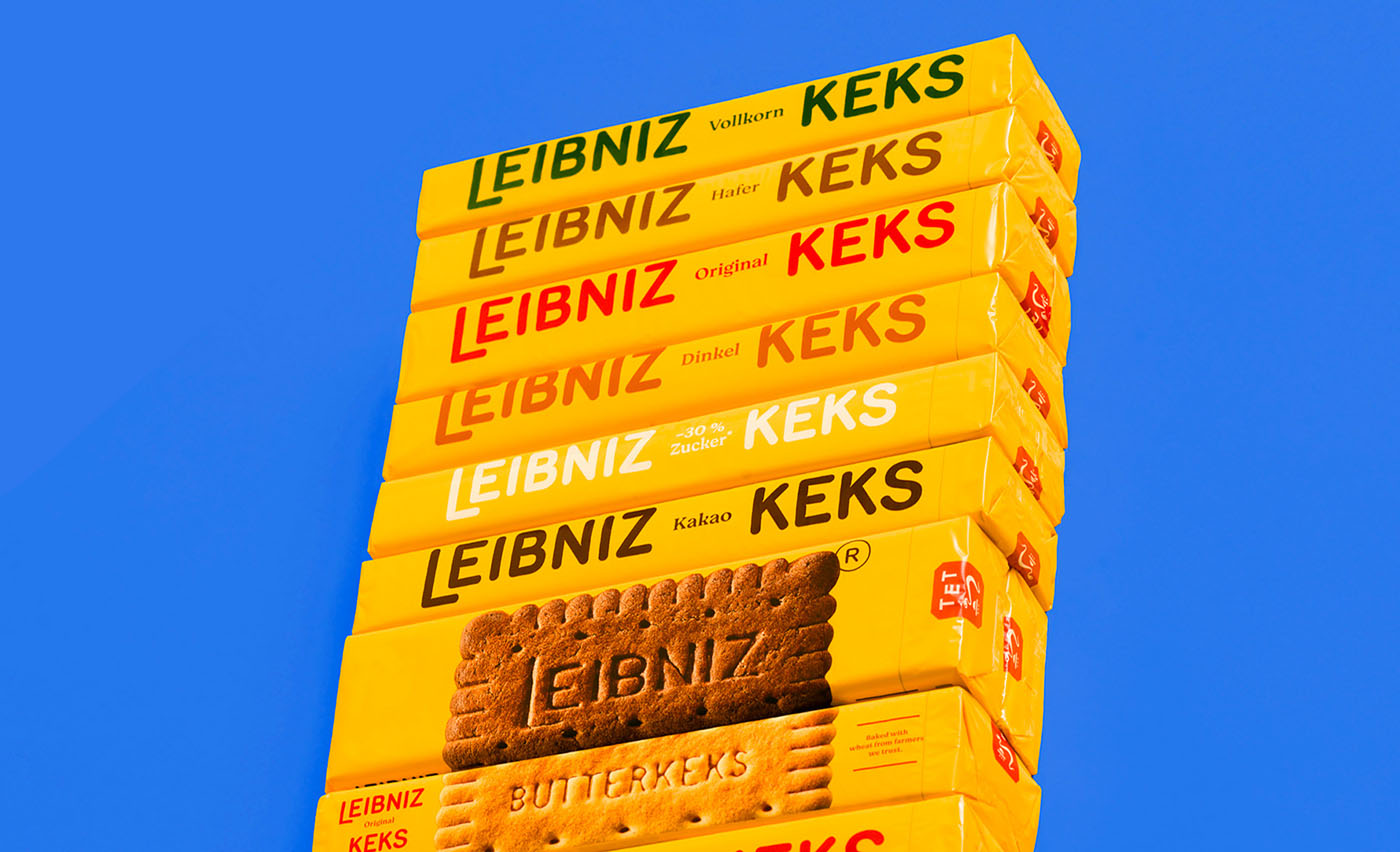
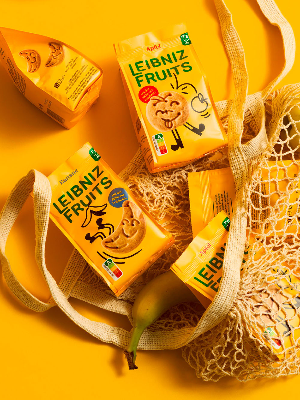
The warm new tone of the identity has been achieved by amping up the recognisable Leibniz yellow; Auge has improved its sunflower tone across the new packaging ranges. A delightful and new illustrative system has also been developed for Bahlsen’s kid-friendly Zoo range. Its packaging has taken a minimalist new turn; Auge uses macro photography to enhance the biscuit’s texture while the distinctive Leibniz yellow “increases the wall impact on shelf”, Auge states.
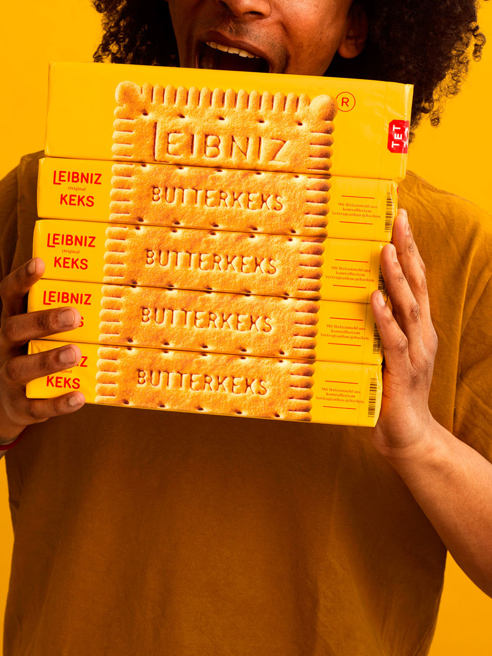
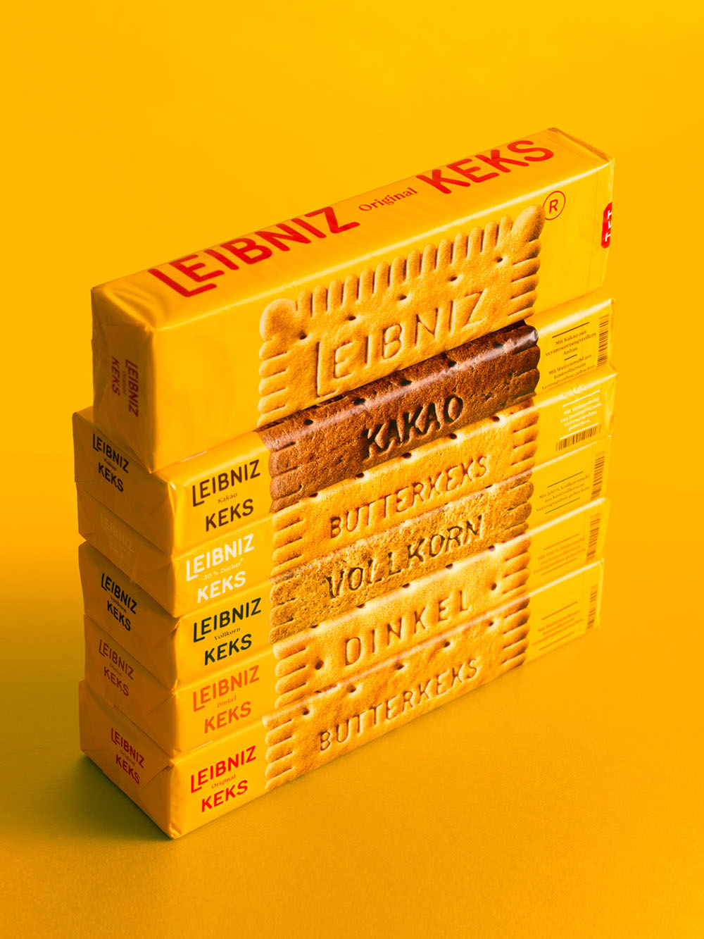
The original Leibniz biscuit design – comprising those 52 teeth with “Leibniz Butterkeks” imprinted in capital letters – has remained the same since 1891. “And this was exactly our starting point,” Auge confirms, “the strength of a shape that manages to embody all the necessary information on the product by itself, the ultimate hero product.” The new brand graphics will appear across six different biscuit ranges, with the golden palette uniting each of the brand’s offerings.


![]()
Designed by: Auge Design
This project on Behance.


