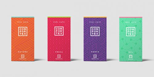
Упаковка Confortex Condoms
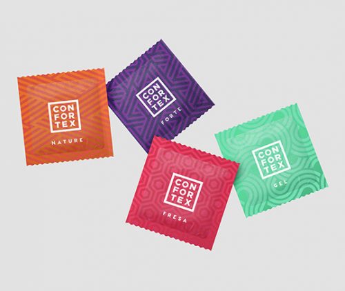
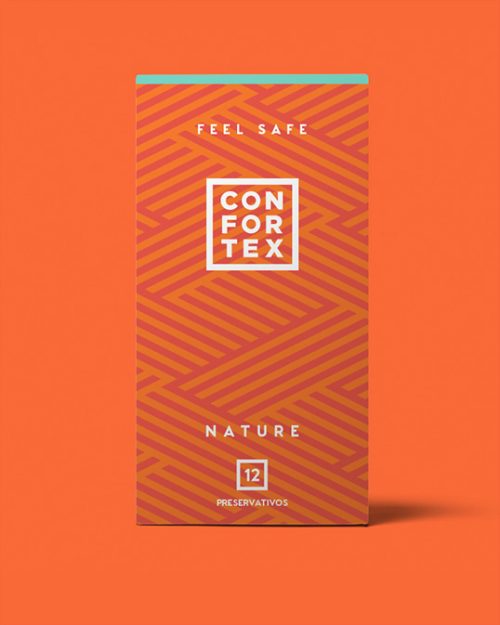
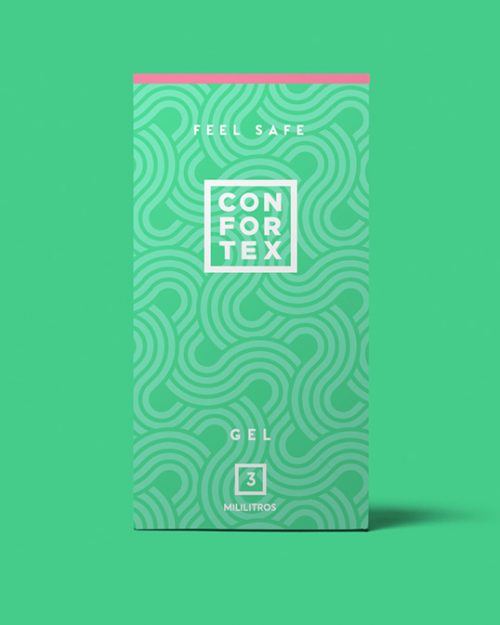
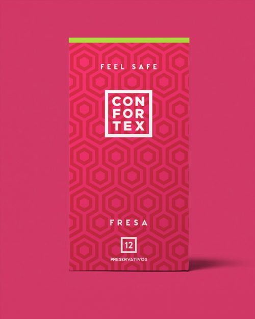
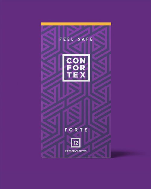
В Испанской студии The Wook Co. создали проект упаковки для презервативов, призванной изменить общее впечатление о продукте.
Вот, что они написали:
“When Confortex’s project arrived to our door we thought that there couldn’t be a more self-rewarding branding project than redesigning a condom’s brand. Confortex is a strong established brand of condoms that have always sold their products via third party distributors. Following a new business objective, they suddenly had the urge to sell directly to final consumer, and for that reason they also needed a brand new image, final consumer-oriented and of course differentiation from their competence. As part of our work method when modifying an existing brand, we usually love finding “that something” that was there all the time, making the brand special from their early beginnings and transform “that something” as a fortitude of the new brand. Confortex was the very first brand to include instructions within their foil unitary packaging, and we thought that was a very cool differentiation to use as a base for the new brand.
The logotype symbol is framed as that foil unitary condom package that made them different. For the packaging system we established a reduced color gamma, two base colors and one accent, and we created pattern based designs for each variety box to make them totally unique and memorable, to assure a wide variety of possibilities for the brand’s future products and of course to differentiate from their competitors on the store display.”

