Street Food Box

Street Food Box is poised to take on the waste generated from our takeaway habit. Our lunch on the go habit generates 11bn items of packaging waste a year and mouths drop open when hit with the startling fact that 91% of plastics aren’t ever recycled. Street Food Box is a reusable packaging option for food realists, time-poor urbanites, and a generation that values the environment as much as their takeaway lunch. Creative agency, White Bear, was chosen to help educate consumers on the importance of reusing over recycling.
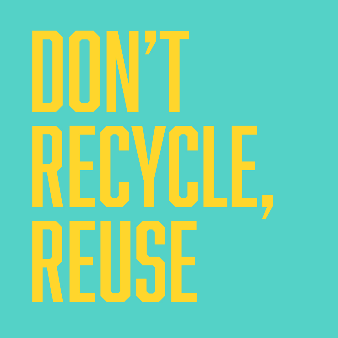
REDUCE, REUSE, DON’T RECYCLE
For the initial creative concept, White Bear explored what comes to mind when people think ‘recycle’. “The universally known recycling symbol inspired us to transform the product itself into its own recognizable symbol. The logo and brand icon immediately convey the entire purpose of Street Food Box before the package is even unopened. The bright colour palette and street inspired typography appeals to the brand’s time-poor, Millennial and Gen Z demographic. To generate chatter across digital and turn their heads we played with language like ‘Don’t recycle’.”
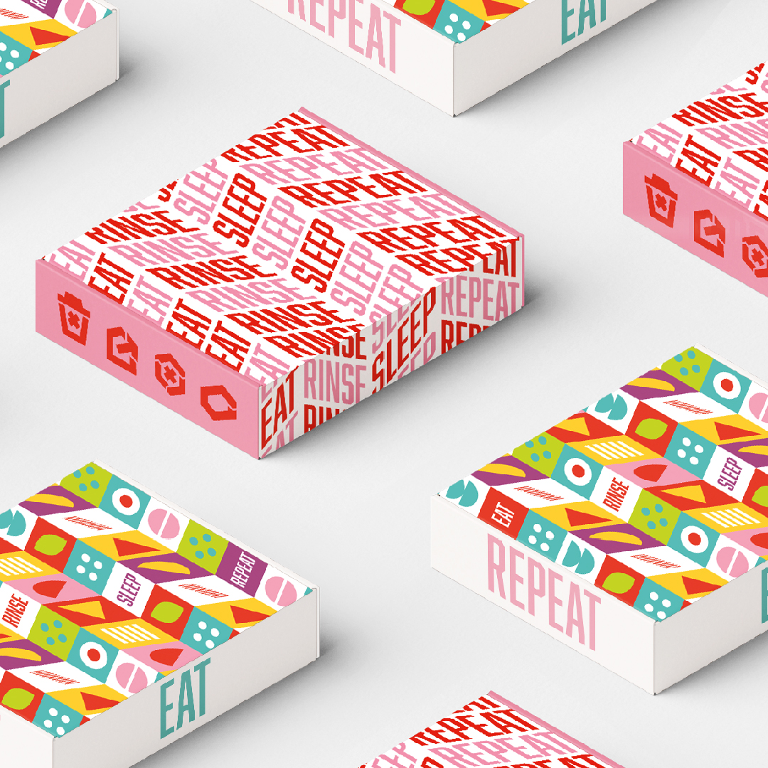
EAT, RINSE, SLEEP REPEAT
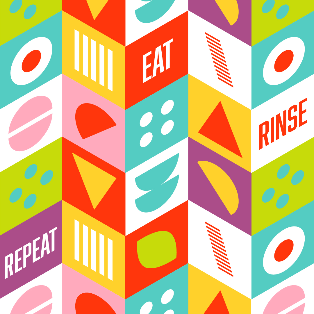
The White Bear team went on to play with the campaign strapline ‘Eat, rinse, sleep, repeat,’ which tells customers how to use the product while simultaneously ringing loud as a memorable brand mantra. In a similar repetitive style, they created a pattern to be used across packaging, customizable to the fast-food chain it will appear in. “This repetitiveness ties in with the campaign line and the behaviour we want our consumers to take.”


Text from: packagingoftheworld


